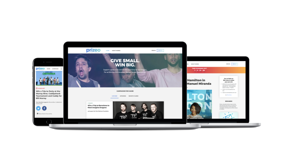
As the lead Product Designer for Prizeo at Charity Network, I work with product management and the technology team to design a cohesive suite of products on multiple platforms that raise millions for charities worldwide.
During my time leading design for these products, we have redesigned almost the entire website, launched new branding, and tested product improvements with an iterative approach. We have launched entirely new features, during which I was involved from inception to launch and beyond.
One of my big focuses for this product has been making improvements to the overall user experience to enable us to grow the platform from a typically one-time-only use for our users to a community of philanthropic-minded consumers that come back again and again to donate to charities they support and to win some cool prizes along the way. I’ve highlighted below a few of the projects on which I’ve led design at Prizeo.
Home Page Redesign
Project Brief
Because of the way Prizeo operated as a business at the time, its home page was one of the least visited pages of the site — most traffic came via targeted ads and social posts directing traffic to a specific campaign.
The origin of the project came from a simple request from our business development team: We need the home page to be sellable to clients. Prizeo had also undergone a re-branding prior to my start at the company, which was rolled into this project as well.
Process
Knowing the direction we wanted to take the product within the next 1-2 years, I wanted to approach the project with a longer lens than the initial ask called for.
With that in mind, I sought to expand our homepage to support a more traditional community-driven website that could one day support a marketplace and entice users to return to browse for new campaigns. To that point, Prizeo typically consisted of around 5-6 campaigns live at any given time.
We needed a new structure for our site that allowed it to grow over time and accommodate an increase in volume, which was an inevitable evolution for the product.
In my research I found that less than 5% of all traffic landed on Prizeo’s homepage — there simply wasn’t a reason for users to return. Because we didn’t have the volume at the time, we decided to focus more on content revolving around our bread and butter: Our experiences and our winners. This enabled us to move forward with the project and accomplish our short- and long-term goals.
We now had a home for our engaging content, and a good foundation for future growth, which has allowed us to organically expand and sell an increased number of campaigns.
Like a lot of small teams, we struggle with resources, particularly with having time to create the assets needed for our campaigns, which often have very quick turnaround times. To help alleviate this, I began implementing a simplified design system that maintained consistent dimensions for our creative team so they can focus on creating one set of graphics that work at any size screen, freeing the team up to be more creative and spend time on more big-picture projects. The resulting redesigned home page helped set the foundation for the future of the product and helped jumpstart our expanding campaign offerings.
I worked very closely with our development team troubleshooting CSS and HTML issues and working through roadblocks to make sure the outcome of the project met our high standards. What ultimately was built helped set the foundation for all the work I’ve done to date on the product.
Prizeo Rewards
Project Brief
One of our big goals for 2018 was finding ways to incentivize our community to become repeat donors and become advocates for the site as our platform grows to supports a more active user base. The first step in realizing that vision was building out an incentive platform for our community that rewards them with tangible benefits and gives them organic (and multiple) ways to share campaigns with friends and followers and allows them to track their progress via milestones.
Process
I worked with the product team to determine the rewards we would offer for different milestones reached as a Prizeo user.
Once we had a solid idea for how these milestones and rewards would work from a structural standpoint, I strategized how to introduce this new program to our users, represent these new badges within the Prizeo product, and design the feature in a way that could be expanded on in future iterations of the product.
One of the biggest problems we needed to solve while designing this feature was the introduction of our new Ambassador feature, which allows our Prizeo donors to create their own campaign page and, in turn, be rewarded for doing so.
This provided a great opportunity for us to organically introduce unfamiliar users to this new feature, which hadn’t been truly introduced on a large scale.
For inspiration I turned to products I’ve found that do an exceptional job at properly gamifying progress and rewarding users. Treehouse is one of my favorite examples of this, as I haven’t come across a product that incentivizes using its product as organically as it does. I wanted to bring a bit of the dedication that I’ve felt using Treehouse into the Prizeo product.
The great part about this and Prizeo? We are continuously evolving our brand and finding ways to inject personality into our product voice and evolve Prizeo into the product it should and needs to be. So this sets us up for a ton of possibilities to expand on this in the future and find more ways to keep our donors more involved in the Prizeo ecosystem.


