As the lead Product Designer for Charitybuzz at Charity Network, I work with product management and the technology team to design a cohesive suite of products on multiple platforms that raise millions for charities worldwide.
The Charitybuzz platform is unique in that is has somewhat of a finite audience (top-tier income individuals), and a very unique set of “products” available at auction, which in turn supports a charity or cause.
I work with the product management team, development team and upper-level leadership to grow our product offering and improve the experience for our users. We operate as a relatively small team, so I work closely with the engineering team to polish our site visually, often contributing to front-end development as much as I can.
During my time leading design for these products, we have worked to take a more data-informed approach to our design practice, which has paid dividends and allowed us to show the value of our product enhancements. We have improved the overall user experience, launched new branding, and tested product improvements with an iterative approach. We have launched entirely new features and sections of the site, during which I was involved from inception to launch and beyond.
Re-branding efforts
Project Brief
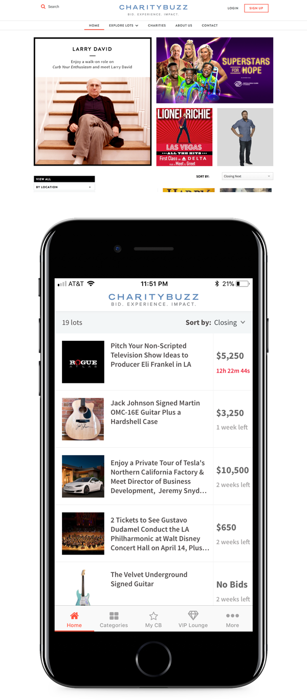
Prior to my arrival at Charitybuzz, a re-brand was nearly completed, but had yet to be implemented. One of my first projects involved incorporating the new branding into our website and app.
I used this opportunity to begin establishing our design system and addressing user experience issues throughout the products.
Process
When I began working on Charitybuzz, the website and app were littered with inconsistencies from a branding and user experience standpoint. My first goal in taking over design was to unify the products and begin rebuilding the foundation upon which Charitybuzz exists. What has resulted is a much cleaner and easier to use product that has improved the ability of our charity partners to raise money through high-end auctions.
Charitybuzz prides itself on the incredible, high-end and unique experiences it offers to donors, so one of the primary goals with the new website was to reinforce our position as the go-to place for high-end luxury products and experiences.
To accomplish this I wanted to drastically clean up the appearance of our products to reflect elegance and simplicity, which in turn would benefit our business goals of more bidding and higher income for our charity partners.
While working through this project, I took the approach of stripping everything that wasn’t truly necessary out so that we can more effectively focus our users on our products.
The result is a truly simplified website and app that set the foundation for a multitude of new features and product enhancements we rolled out in 2017 and 2018.
Lot Page
Project Brief
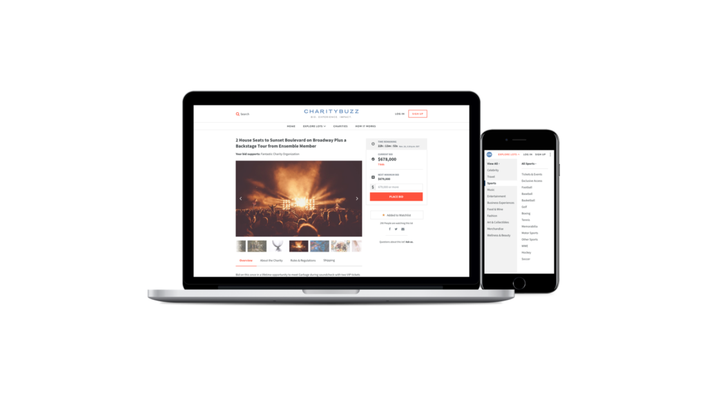
The Charitybuzz lot page is the heart and soul of the company. It’s by far our most traffic-heavy page and our most important from a bottom-line perspective.
We entered the year with the huge goal of improving our user’s experience when bidding and increasing our revenue from our work.
Process
I worked with the product team to determine to determine our goals for the lot page and how we would approach the process.
We knew we wanted to test anything we did with the lot page because it has such a high impact on our business, so we did the legwork to determine what success would look like for us as a product team.
After doing a ton of competitor analysis, I got to work sketching design ideas and collecting pieces from various sources that I wanted to incorporate into the new lot page.
One of the biggest problems I set out to solve throughout this process was removing as much friction as possible from the bidding process.
The pricing for items and experiences on Charitybuzz tend to skew to the higher end,
so completing a transaction is by no means an insignificant decision. I wanted to reduce cognitive load for our customers by stripping the bidding action down to it’s simplest experience and make it easy to convert a user to a bidder.
After testing our new lot page, we found a significant increase in bids per lot, one of our guiding metrics for conversion.
Charitybuzz App
Project Brief
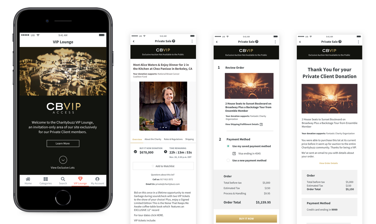
One of our most ambitious and successful initiatives of 2018 was the launch of our VIP program at Charitybuzz. We wanted to give our highest-value customers exclusive access to lots not available to the general public and incentivize them to donate even more than they already do. This eventually materialized into our new VIP Access section.
Process
I worked with our Private Client and product teams to concept what we needed to accomplish and began sketching out early ideas and functionality.
We knew this new section of our app needed to feel special. A true white-glove experience that reinforces who our audience is and truly gives them an experience that nobody else who uses Charitybuzz gets to have.
After a few different iterations, we landed on our final product design and began rolling it out to our VIP customers, which has opened up new streams of revenue for the company and allowed us to partner with other luxury brands to increase the number of high-net-worth users of Charitybuzz.
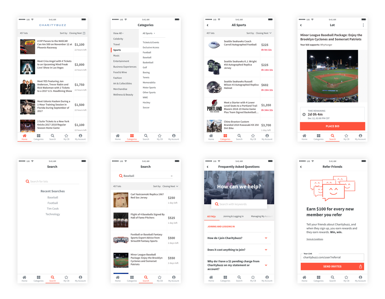
Throughout the year, we also made strides in improving our app and simplifying navigation and bidding to make it easier for Charitybuzz users to bid on experiences and make the process of philanthropic giving more rewarding.


